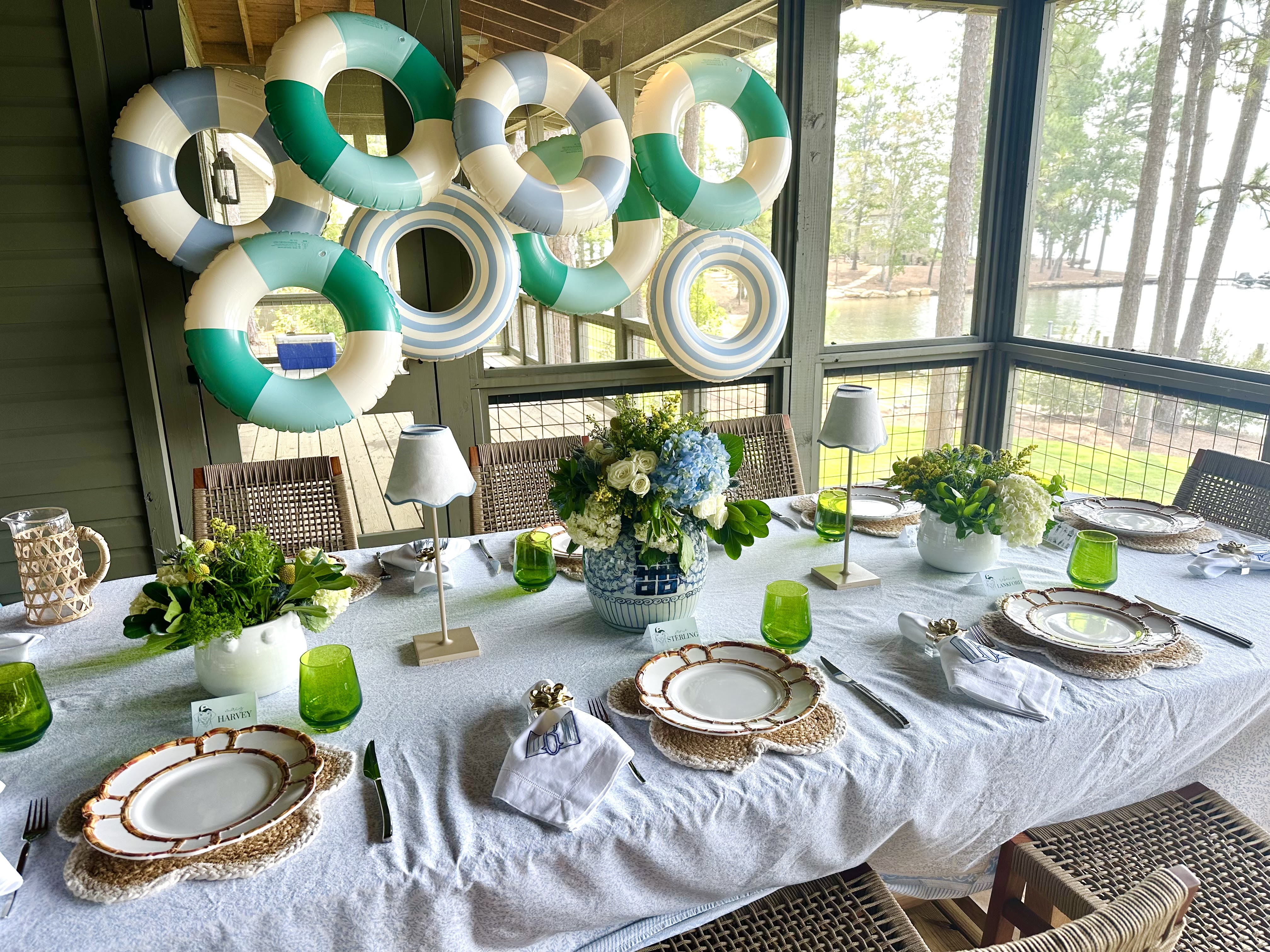
As my planner said the other day, “It’s crunch time.” While that sounds a little overwhelming, I’m viewing it that we’re in the home stretch of wedding planning. After a call with our officiant and photographer later this week I feel like most of the big stuff is finally done! The main things left to do in preparation for the wedding are ordering a few items like welcome bag gifts, koozies and napkins for the reception, exit items, and dance floor props all of which feel like fun buys.
We’ll be receiving the digital version of our crest soon, which is what we plan to put on some of these items and as I’ve been envisioning how those pieces will turn out I’ve been reminded of just how much I love the custom crest we created with Paper Eliza. I’m thrilled to share a bit more about the meaning of some of the elements on our crest and introduce you to Eliza to learn more about the process of creating your own!
Eliza and I met pretty early on after I moved to Birmingham but don't ask me where or how because I've blanked on that. I had started following her while she was still at Samford, and I had ordered a few different items from her over the years as gifts! When we got engaged and started to think about our save the dates using her to design a crest and create them was a no-brainer for me! After lining up our church and reception venue she was one of my next emails.
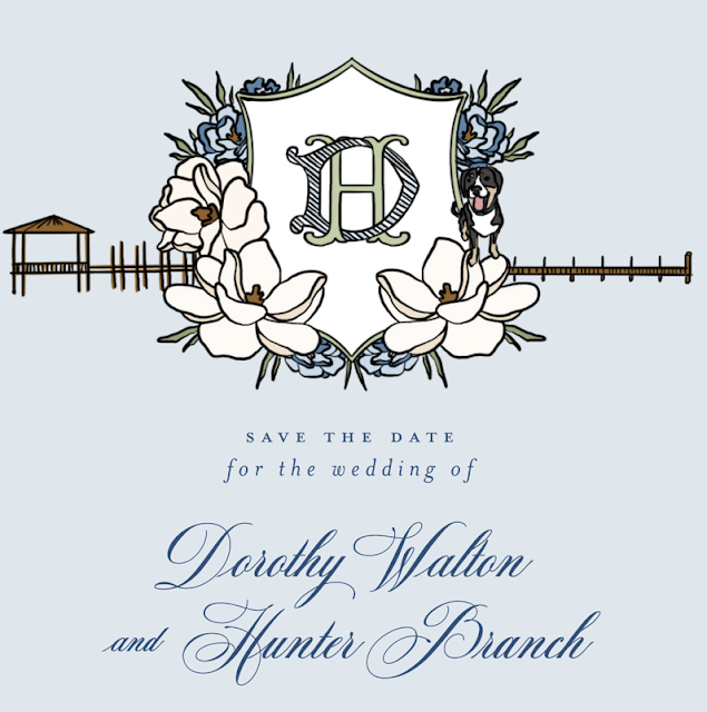
When it came to deciding what we wanted to put on our crest, Hunter and I went back and forth on quite a few ideas. Including Winnie was an obvious choice to include, but we also both went to Furman and were toying with the idea of including the iconic bell tower from there on the crest. Ultimately, since we didn’t really meet until after college Furman didn’t fully feel like a shared part of our relationship we strayed from that thought. Hunter knows how much I love magnolia trees and suggested including the flowers since Eliza often incorporates flowers of significance into her crest designs. We kept talking about wanting to include our love of the water into the crest given the time we’ve spent together at Hunter’s family’s lake house and my family’s beach house but struggled with how to do that. Since the docks/piers at each location look so different, Hunter had a great idea to incorporate them both on either side. The pier on the left-hand side is what is typically in Fairhope and near my family’s beach house while the dock on the right-hand side of the crest is more of what we see at the lake. I love that he came up with that idea and love how Eliza executed it even more.
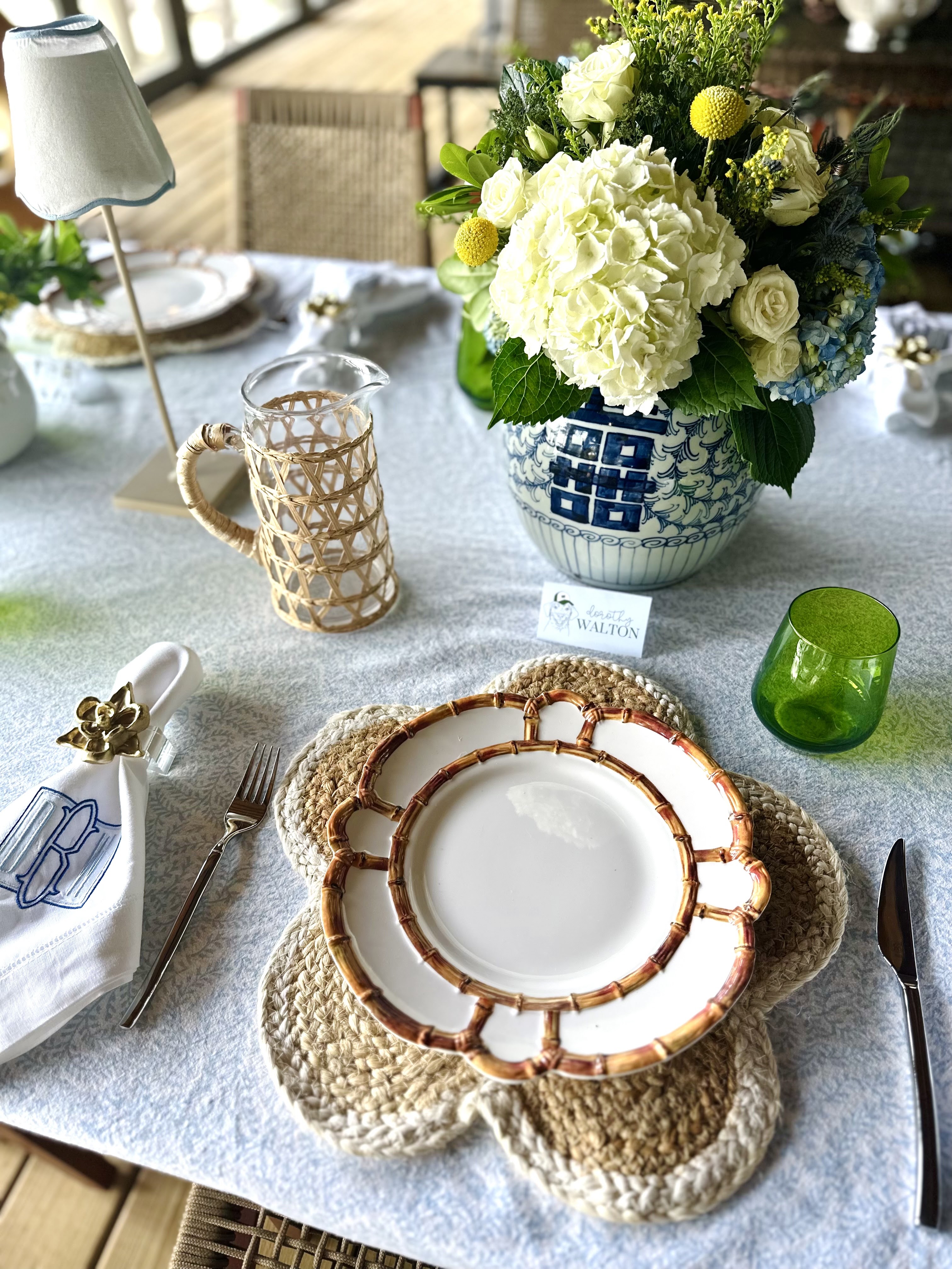
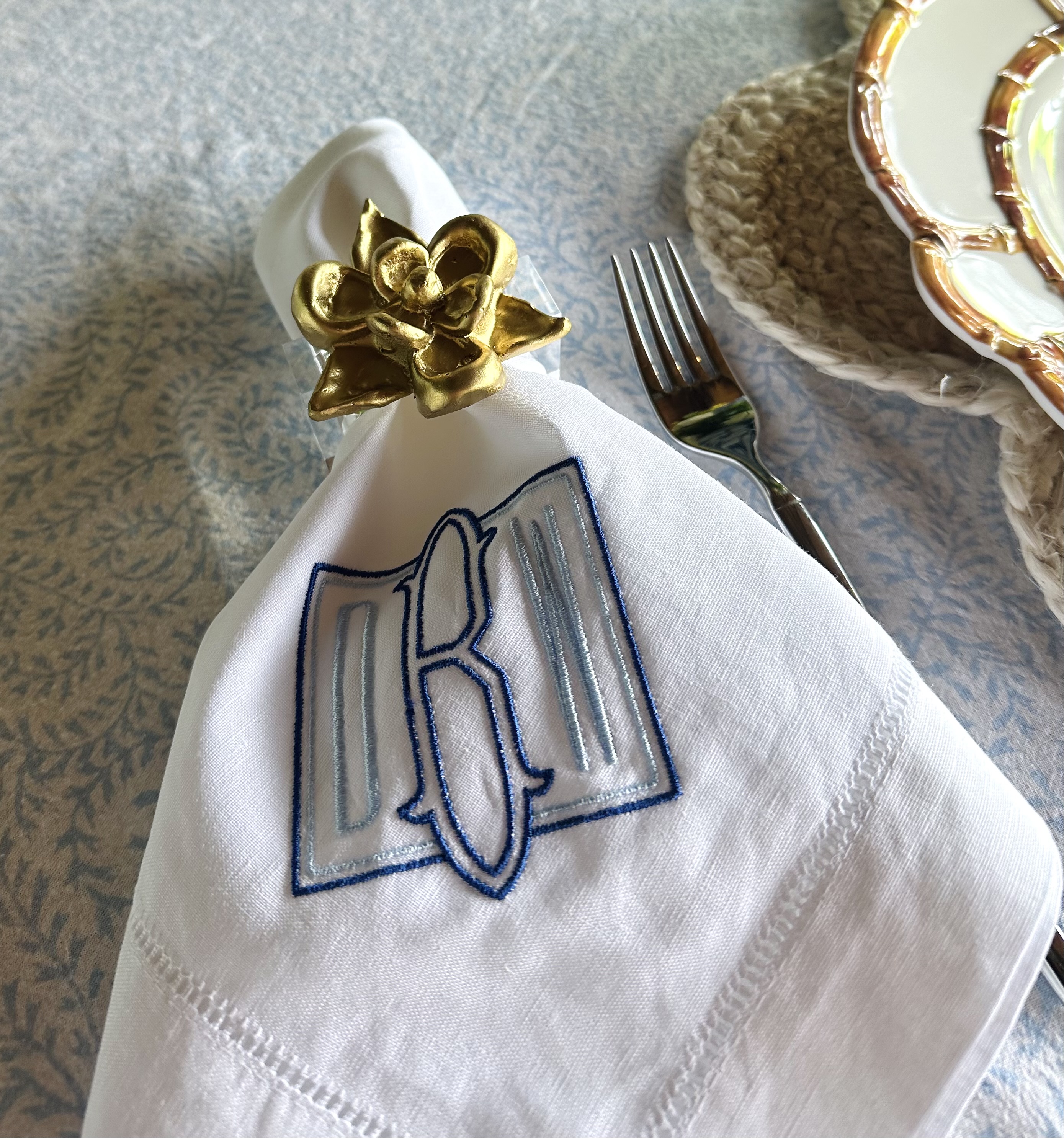
Choosing colors for our crest proved to be a little tricky at first. Originally tried to embrace our date by leaning toward fall colors, but after seeing the initial design decided to stick to what I know with brighter colors in our wedding color palette! We ended up choosing a blue invitation color with navy text in two different fonts. Eliza provided us with so many different examples of fonts and layouts that it felt easy to choose favorites from her examples to narrow from there. I’m so thrilled with the way it came together, and I am eager to see how it looks on our welcome bags, koozies, and napkins!
For those of you wondering a bit about Eliza and wanting to hear more about the process of working with her read on!
How did you get started on Paper Eliza?
I started Paper Eliza in college years ago. I had a couple of friends go away to summer camp to work and they had asked me to create a stationery set for them to take with them. I knew my way around Adobe and knew I could design them something, so I called up a fulfillment printer, printed the first set, and the rest was history! I now specialize in wedding paper and took it full-time over a year ago.
Growing up did you always love art or when was it that you discovered that love and talent?
I did! But honestly, I never considered myself an artist, and honestly, most days still don't ha! My passion is business and entrepreneurship and I am so thankful that the Lord has opened these doors for me and allowed me to get to do something that uses both my gifts and talents AND lets me own my own business! I am living the dream!
What does the custom crest process look like?
It is so much fun! The design process starts when you place the order for the product. When checking out, you have two options - one for a "Paper Eliza Usage" crest and one for a "Digital Only" crest. The digital crest is more expensive because you will have the licensing rights to print your crest on any and all paper products from outside vendors. This is perfect for people who already have a print shop that they want to use. The "Paper Eliza Usage" option is cheaper (by a lot!) because it discounts the crest since the bride is choosing to use Paper Eliza to print it on her wedding paper - save the dates, invitations, day-of paper, etc. The bride would have the right to print it only on Paper Eliza paper and will receive the crest six weeks out from her wedding day in digital formats so that she is able to use it on nonpaper products like koozies, napkins, cups, etc. as well.
When adding the crest to your cart, you will answer a series of questions that help me understand what you are looking for in your crest. Specific flowers, a duogram or monogram, colors, etc! If you are wanting to include a pet, I'll request that you email me a picture so that I can accurately illustrate it - and the same goes for any other specific or niche elements that you want to include. I'll illustrate it for you and email over your proof. We build proofs crest by crest and won't send multiple options at once because we want to make sure that every round of proofs is getting us closer to the ultimate vision.
What advice would you give brides as they work on their crest and decide what to include on it?
Definitely have a good idea of what you are looking for before you purchase the crest! The less of a vision that you have going into it, the longer the design process tends to take. A very popular thing to include that sometimes people overlook is state flowers! I loooove including the bride's home state's flowers, the groom's home state's flowers, and the state that they met in. It is subtle and special and makes the crest so unique!
The paper process for weddings can feel overwhelming, do you have any tips on how brides can enjoy it more while still dotting their Is and crossing their Ts?
Adding personal touches to your paper can make it feel exciting! No one in the world will have the same custom crest with you and I think it really helps with the excitement of seeing visions and dreams come to life through the design and proofing process. Our site is built out in an a la carte fashion so that you can customize the papers in your suite to perfectly fit what you need, which I also think helps make it feel less overwhelming - you are getting only the cards of what you need.
If you had to guess, how many brides have you worked with to date?
Whew, definitely a couple hundred! An honor I do not take for granted.
What is the most unique item you've seen one of your crests appear on?
Mardi Gras beads were a fun one to see! And the University of South Carolina towels to wave at the reception - a tradition special to USC game days for the couple. I love those little personal elements.
Outside of wedding paper, what are some of your favorite products to work with clients on?
I love a party invite! We do a lot of ad hoc party paper. If you don't see a product on my site, it's always worth shooting me an email to see if we can work on special projects.
Is Paper Eliza your full-time role, and what is your favorite part of your job?
It is! I love getting to meet so many different people and hear about their visions and dreams for their big day. It is so fun and special.
What's the best way for people to see your work and place an order?
The best way for people to see my work is probably my Instagram. We are constantly sharing new projects there! But placing your order will start your custom paper process, so you can find my site here to get started. Feel free to shoot me an email if you want to hear more about the custom paper process - I am happy to shoot over my digital guide walking you through the process.